Understanding the brand
Arteon needed an identity that could stand out in a crowded field. Distinctive, confident, and instantly recognizable. The goal was to define what the brand stood for and translate that into a visual language that felt unmistakably its own.
Designing a cohesive identity
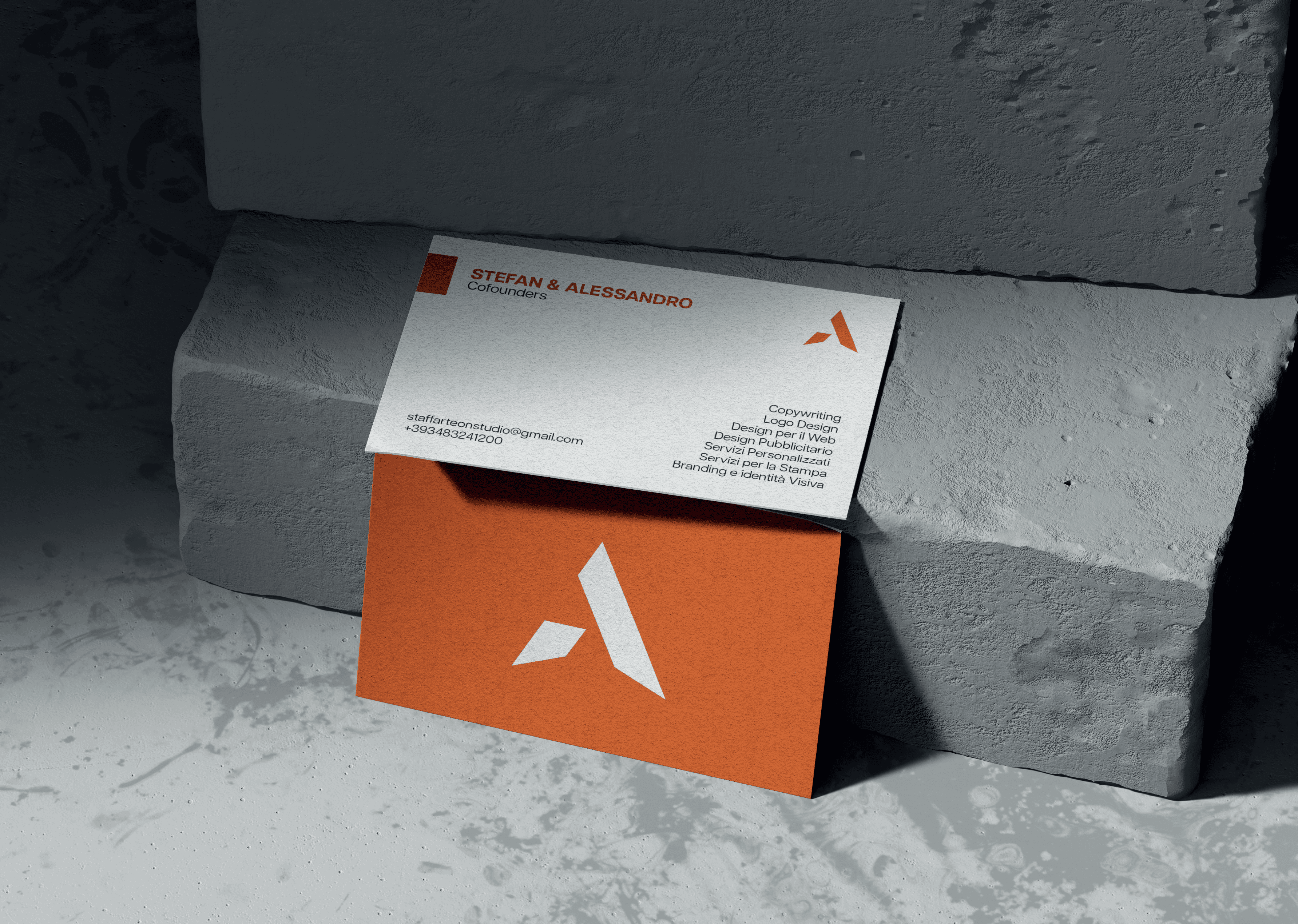
Starting from the brand's character and values, we developed a logo mark and a complete visual system. Color, type, and supporting elements that work together across every application. The result is an identity that's bold, flexible, and consistent wherever it appears.


A bold, distinctive identity
Through a distinctive logo mark, a considered color palette, and a flexible visual system, we gave Arteon an identity that's bold and unmistakably its own.
A brand built to scale
The result is a brand that reads with confidence across every application: cohesive, recognizable, and ready to grow alongside the company.